Best practices
- Five minutes! One topic, one board, stop. (Doubt it? See How Video Production Affects Student Engagement)
- Plan your talk so you know where you are going to be drawing on the lightboard. If you need to erase (much) or add another board, it’s probably too long.
- Pause before starting, and look at the camera. This gives you a clean cut point, to edit out your walk-on.
- Smile!
- If people are going to watch several videos, they don’t want an intro on each one.
- You can add text in youtube. This can be for a superimposed intro caption or a topic name, or for reinforcement or corrections. Use youtube’s annotations of the types called notes and titles.
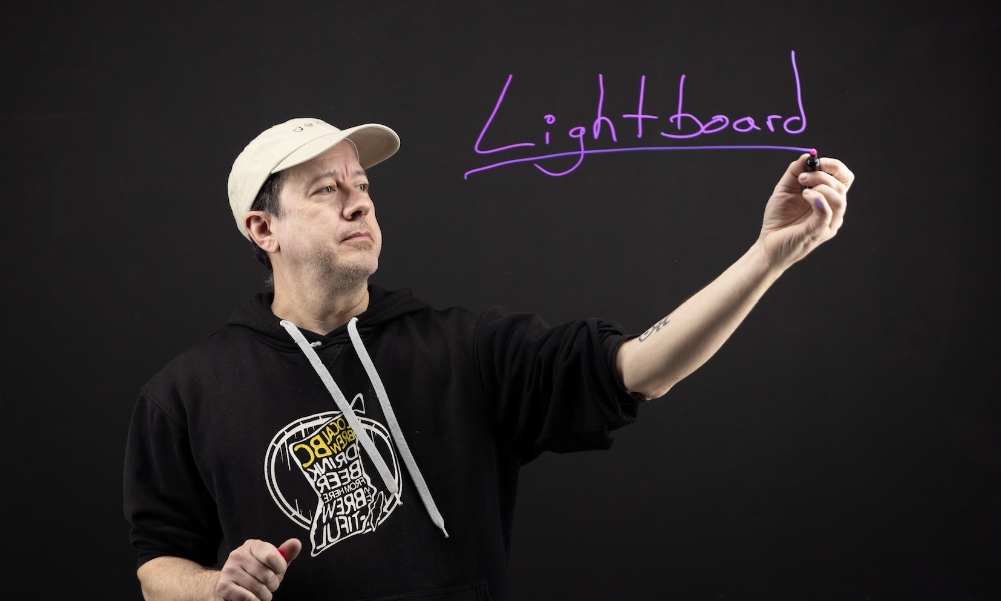
- Dark clothing works best so your writing is readable in front of your clothing. Deep blue is really nice. No text on clothing.
- Expectations for videos are higher than for classroom lectures, but you needn’t strive for perfection. Good enough is good enough.
Markers
- When writing on the board, look at what you are writing. When talking about something on the board, point at it and look at it.
- When you aren’t writing or pointing, look at the camera. It may be helpful to seat someone under the camera.
- Leave yourself a window. Or at least try not to draw horizontal lines through your eyes or mouth.
- When pointing, try to point from the side, not from the back, so that your fingers stand out against the black background.
- Don’t hold the marker when you are gesturing or pointing. Put it down, or hold it in your other hand.
- Put the marker caps somewhere else altogether. The markers will be ok without their caps for the duration of a video.
- Dry-erase and wet-erase markers squeak. To reduce squeak, use fresh markers and don’t push so hard against the glass. With a light touch, you can mostly avoid squeak.
- Liquid chalk markers don’t squeak, but they need more care to keep the tip fully saturated.
- Markers are slow to erase. To avoid smearing erase with a dry cloth first, and then remove any residue with glass cleaner.
Powerpoint
- The five minute rule still applies!
- Set the slide background to black, and the page aspect ratio to 16×9 before you start. Powerpoint is not good with page layout changes later; it will stretch your slide content. Here’s a template powerpoint deck.
- Leave space for you. You become a character inside your powerpoint slide. (You can also put all your content in a traditional corner inset, but that’s way less cool.)
- Try something other than the usual “bulletpoint talk”. How about adding hand-written items interspersed with just a few powerpoint bullets. Hand-written check marks. Or cartoon sketches but no text.
- You can use a second monitor for notes, or even as a teleprompter.
- You can make secret dots in dry-erase black, on the glass, using your powerpoint in advance. Then you can point straight at those, which is much slicker than the “weatherman wave”.
- You can run a movie in powerpoint, and even point to things in a movie as it runs.
Taken from https://www.lightboard.info/best-practices
